Written by Neil Milton
As a street photographer, I much prefer the camera in my hand than sitting on the shelf as I agitate a development tank, or scan endless negatives. Nevertheless, five long years of therapy have shown me that I am both a perfectionist to a fault, and that I must have control of my creative process.
When it came time to print my photographs, it was inevitable I would have to learn to do it well, myself.
For convenience, I began with black and white giclée printing my scanned and processed negatives, and it was a more turbulent journey than I had expected.
Note: I am by no means an authority on this subject, though some of this article borrows from advice I have been given by experts in fine-art printing. This can be an expensive business, though I hope to guide readers to make some good early decisions to avoid some of the waste of time, materials, and money that I suffered.
If you’re looking for darkroom printing, check out this article here.

Choosing a Printer
My first big decision was which printer to buy.
Reviews and articles were clear that if serious about printing, I would need a midrange Epson or Canon printer that can deliver A3+ prints. The former has their Epson SureColor range, the latter, their Canon Pixma Pro.
Epson has an advanced black and white mode built into their driver, and Canon has an additional software called Print Studio Pro. Both can be used to finesse the warmth, coolness, and tonal curve of the black and white print.
For both financial and practical reasons, I opted for the Canon Pixma Pro-100S. However, when choosing a printer, spend time to read numerous reviews both good and bad, watch YouTube demonstrations, and ensure you choose one right for your workspace and the results you want to achieve.


Paper Options for B&W Prints
A choice of photo paper begins with the material. Broadly speaking, there are 2 candidates, resin-coated, and fibre-based papers.
Fibre-based papers may be made from alpha-cellulose (wood pulp) or cotton, and resin-coated (RC) papers trap the fibre base between two layers of plastic.
The latter, though more difficult to tear or scratch, can appear thinner and the plastic feel is undesirable to some. Though if your photo will be often handled, it may be an option.
I chose fine art fibre-based paper as it has a tactile, textured quality I enjoy.
I then had to decide whether my prints would be matte, glossy, or somewhere in between. This, of course, is a personal preference, though if uncertain, most manufacturers offer a sample pack which provides two sheets of each paper to test.
For my affections, it has been a battle between the French and the German. In the Gallic corner, we have Canson, and over on the Teutonic side, sits Hahnemühle – both founded in the 16th century, don’t you know.
I bought Canson’s Infinity Discovery pack and Hahnemühle’s Digital FineArt Collection to test. Both are excellent, though after some deliberation, I finally chose the Germans’ FineArt Baryta and FineArt Baryta Satin papers.


Setting Up Your Monitor and Printer Profile
Before a print is made, it is important to profile both the monitor used to prepare the image file and the printer/paper combination. This is a process to ensure the output provided by the printer will match, to the best of its ability, the image that is displayed on the screen.
While this is vital when printing in color, for black and white, it is nevertheless important to match contrast, or warmth of a print – particularly if printing in duotone or tritone.
Profiling Your Monitor
There are several excellent profiling systems available, some are more affordable than others. I chose the X-rite i1 Studio, the latest version of which is now being sold as the Calibrite Colorchecker Studio.
The process is simple. The profiling software will cycle through over 100 colors displayed on the monitor, which will in turn be scanned by the hardware device, artfully hung over the face of the screen.
After which, based on the input, adjustments are made to ensure the monitor’s output is neutral, and a new color profile is saved in the computer’s operating system to be chosen in the display settings. It takes all of 5 minutes, then the monitor is calibrated and good to go.

Profiling Your Printer
Ensuring the printer is also calibrated with the chosen paper is both important, and a little more complicated.
Manufacturers provide their own ICC profile for the printer and paper combination, and it can be downloaded from their website. However, it may be more accurate to make a new profile.
To begin, a target provided by the profiling software is printed on the chosen photo paper. Using the same monitor calibration device, the color swatches on the target are scanned, and the print from that specific printer on that specific paper are analyzed.
Based on this analysis, the software will generate two further targets to be scanned and analyzed for further calibration.
Afterwards, a color profile is saved on the computer’s operating system to be chosen when printing using this printer/paper combination.

Running into Profiling Problems
Despite following the instructions on online tutorials, product manuals, and taking advice from forum threads, this was where I made my frustrating and expensive mistake. After making this error, I would estimate I wasted around £150 of paper and ink trying to work out what went wrong.
Print after print after print, and no matter what I would change, I could not make the output match what I had on my screen. I was close to tears and very close to throwing in the towel and selling my printer when, one afternoon on Mastodon, an incredibly kind fine art printer by the name of David offered to help me.
Through some remote tech (and, to be fair, emotional) support, David diagnosed that when the original profiling target was printed, it was using an unknown profile, and, on MacOS, at least, there was nowhere in the software to change this.
The result, then, was that the target swatches were not output as the printer’s true representations of those colors. It is vital to ensure the targets for profiling are printed as the printer sees them with no software interference.
The solution for this was to save the target/s as pdf files, then print those pdfs from photoshop choosing the “generic RGB” color profile. Running through the process doing this resulted in a perfect color profile and finally correctly calibrated prints that represented what was on the screen.
Thank you, David, honestly, I could have cried!

Preparing Your File for Printing
Before preparing files, it is good practice to run a test print containing a step wedge using your printer and paper combination.
A step wedge is a greyscale chart you can print to show how your printer handles different black and white tones. Here’s a YouTube on how to create your own step wedge for printing.
Among other things, the wedge will show at which greyscale values the white and black points show perceptible change into greys. This is useful when setting black and white points on the histogram for the digital file to optimize the eventual print.
It’s now, almost, time to print.
All of my negatives are scanned flat, with no contrast adjustments, to digital negative files (.DNG). I use Photoshop to mimic a darkroom and all further global and localised contrast adjustments are made using curves, and the occasional dodging and burning. After which, I save the result as a Photoshop file (.psd).
When preparing the file for print, however, it is best to duplicate the original .psd file and work from a copy. Changes to contrast and size will, no doubt, be made, so it is best not to do this to the original file. Eventually, you may have several print files for different printer/ paper/size combinations.

Soft Proofing Your Print
Before printing, it is useful to see an accurate representation of how the image will be printed on the chosen paper.
Photoshop’s Soft Proofing uses the ICC profile generated when the printer/paper combination was analyzed and simulates the paper color, the black ink, and how the printer will reproduce the image.
This can save a great deal of time and money by removing the need for costly test prints.
You will find soft proofing in the View menu in Photoshop. Choose Proof Setup, then choose Custom.
In the dialog box, you can choose your ICC profile from the Device To Simulate dropdown list. Check the boxes to simulate black ink and paper color. To toggle the soft-proof on and off, use cmd-Y on Mac, ctrl-Y on PC.
When soft proofing, due to the simulated ink and paper color, the image may look like it has flattened and lost some contrast. The final output for printing can be improved with fine adjustments to the contrast using curves layers.

Printing Your Image
It’s finally time to hit that cmd-P print. Each printer will have its own driver with its own options, so I will keep this section general, discussing options that all printers should have.
Letting the printer control the color handling would mean all our preparation so far would have been for naught, so it is important to choose to let the software (in my case, Photoshop) control this. In doing so, you can choose the ICC profile for the printer/paper combination in the dropdown list provided.

As some papers are more absorbent than others, the Media Type, chosen within the printer driver, is also crucial. This indicates to the printer how much ink it may need to lay down to ensure a sharp, accurate print.
Manufacturers will provide the media type setting to use for their papers with a particular printer driver. For instance, on the Canon Pixma Pro-100S driver, for Hahnemühle’s Fine Art Baryta Satin paper, the Media Type should be set to “Other Glossy Paper.”
At this point, the correct paper source should also be chosen. For thin papers, the standard feed tray will likely be fine, however, for thicker, photographic papers, it is often better to use the manual feed tray.
And that’s it. It’s time to hit the print button and wait with anticipation as the print slowly emerges.

Reviewing Your Print and Final Looks
Once the printer has finished, it is vital to let the ink dry. When the ink is wet, it can look slightly different from the final result and may only appear as expected as it dries.
If the print is for display or for purchase, it may be useful to have a pair of cotton gloves to wear as the print is handled. This avoids any dirt, grime, or oils from skin coming into contact with the paper.
The best place to view a new print is in natural light. As long as there is no direct sunlight blasting through, then a window is ideal. Alternatively, I use Smart bulbs in the room where I work, allowing me to choose a color temperature under which to view the print. A good choice, of course, is 5500 Kelvin, approximate daylight.
Finally, it’s time to check the highlights, check the shadows, check the tonal range of the print and compare it to the digital file. Occasionally some small adjustments are needed, but if soft proofing was a success, then the print should be as you would wish.

Final Thoughts
As mentioned at the beginning, I’m by no means an expert on printing, so this article should serve as a primer – a “Printing 101,” if you will. Something to start your journey, but by no means end it.
I welcome any more seasoned fine art printers to chime in, in the comments, to offer up any other pearls of wisdom, or perils to avoid.
Happy Printing!
Thank you so much, Neil! Neil is a regular contributor here at Shoot It With Film, and you can check out his other articles here, such as 5 Tips to Improve Your Street Photography and Kodak Tri-X: Why I Love It & Why You Should Too.
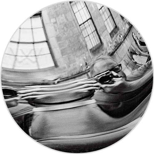
You can find more of Neil’s work on his website, and sign up for his street photography newsletter here.
Leave your questions about printing black and white images below in the comments!


Leave a Comment