Written by Sara Johansen
I love a good experimental film, with one of my favorites being LomoChrome Purple from Lomography.
When Lomography announced they would be bringing back LomoChrome Turquoise, I knew I wanted to try it out.
I did the pre-order and patiently waited (ok, not so patiently, but I digress). When I finally got my order late last summer, I was suddenly stumped on how, when, and where to use it!
Well, I finally got over my hoarding tendencies and took a roll to shoot when I was out in sunny California in February, and then finished it up back home in dreary Iowa.
Here’s a little bit of what I found when shooting LomoChrome Turquoise…
Find LomoChrome Turquoise at lomography.com.

LomoChrome Turquoise and the Color Shifts
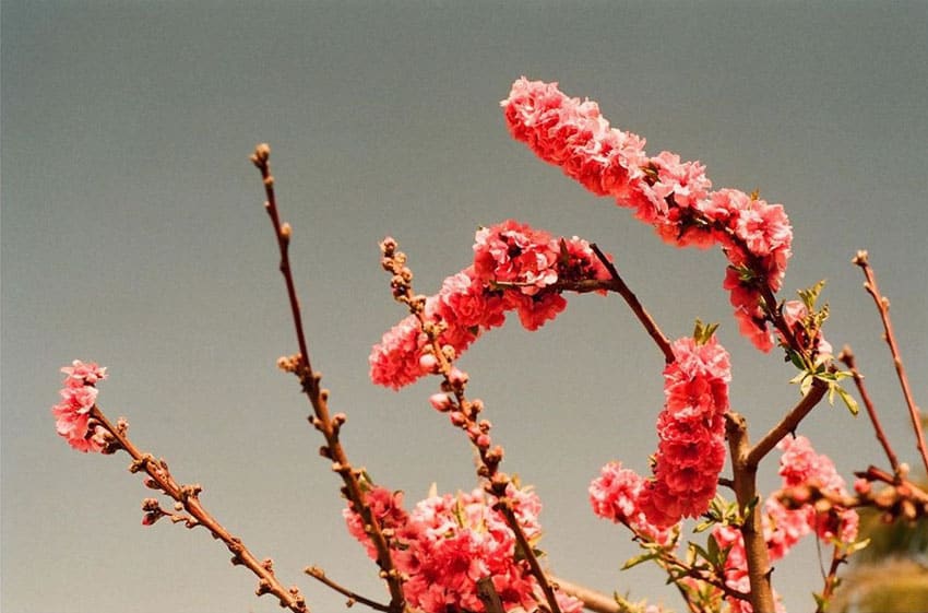
Per the Lomography website, generally this film will shift warm colors to blue, blue to golden, and green to emerald.
While in California, the rainbow walls of my hotel were a perfect way to showcase the color shifts in real life. You can see what the rainbow design of the hotel looks like normally compared to the same spot on LomoChrome Turquoise.


Color Shifts with Different Skin Tones
As noted above, the whole purpose of Lomo Turquoise is color shifts. This means it’s going to do some really funky stuff to skin tones.
I purposefully shot two different people, one with light/fair skin tone and one with warm/brown skin tone. As you can see in the examples, the results are a bit different.
These two images were shot minutes apart in the same setting, same lighting. You can see the light/fair skin tone shifts dramatically to blue, while the warm/brown skin tone is able to handle the color shift much better. This is good to know if you’re wanting to use this film stock with portraits.


How Should You Meter LomoChrome Turquoise and What ISO Should You Use?
First of all, LomoChrome Turquoise is an ISO 100-400 speed film, which essentially means it’s up to you.
I tend to always split the difference and shoot these types of films at ISO 200 (I would love to hear in the comments how you choose ISO).
Just based on my past experience with Lomo Purple, I assumed that Lomo Turquoise is a light hungry film. Honestly, I might try it at ISO 100 next time, but for this roll I was happy with the results at 200.
But, with the idea that it’s a light-hungry film, I did meter for the shadows most of the time, even in full sun.
If you want more saturated colors, I would suggest metering more for the midtones or highlights. But note, if it’s too underexposed, it’s just going to get muddy, losing all of the color shifts.


Color Lines
One thing I noticed is that some frames did have color lines going throughout the negative. I’ve had this before on Lomo Purple rolls, so I wasn’t super surprised to see them again on Lomo Turquoise.
I talked with my lab about them, and it’s just part of the makeup of the film from Lomo, so there’s nothing that can be done to prevent them.
They’re pretty easy to take out in post, but sometimes I leave it in just because this is experimental film after all. So to me, it’s part of the character of using this film stock.

Shooting LomoChrome Turquoise in Full Sun vs a Gray Day or Lower Light
To really get those color shifts to shine, you’re going to have to be fairly conscious about what you’re capturing with it.
What is your lighting like? The color of your subject(s) and surroundings?
From shooting two rolls now, I’ve found that I really like shooting it with lots of clean light or full sun, and also if I’ve got some greenery, it’s going to really pop on a bright blue sky.
To me, the beauty of this film is when the color shifts stand out, but in a cohesive way. Some of my gray day images just didn’t have that contrast, leaving the images to fall flat for me.
This may be more of a preference thing, but it’s still something to consider when you’re using this film stock and determining what you really want to get out of your roll.


Related: How To Shoot Lomochrome Purple Film
Final Thoughts
After all of that, here’s my take. It’s not bad.
Super helpful, right?
But I think LomoChrome Turquoise is the kind of film that needs just the right setting, just the right light, and just the right subject to really shine. Which, when I look back at how I’ve shot Lomo Purple in the past, it’s kind of the same thing.
When I have all the settings for it just right, I adore it! Otherwise, it falls flat for me.
Going forward I will be fairly selective when choosing to use this film stock. Although that said, if you can find a scene that will make it shine, it can give incredible results. I absolutely loved the results from my images in Joshua Tree and Palm Springs, and would use it there again in a heartbeat.


I would love to hear what you think in the comments? Is this a film stock you would try out? Why or why not?
And if you’ve already tried it, I would love to hear your thoughts!
Thank you so much, Sara! Sara is a regular contributor here at Shoot It With Film, and you can check out her other articles here, such as Five Tips for Shooting Film at Night and Film Soup, but at What Cost? Breaking Down the Costs of Film Soup.
You can also find more of Sara’s work on her website, Instagram, and print store.
Leave your questions about LomoChrome Turquoise below in the comments, and you can pick up some for yourself at lomography.com.


Blog Comments
Jen Stamps
March 31, 2023 at 10:53 am
Love this!! The experimental film can be tricky – seeing all the ways you shot it is so helpful. Thanks for the article! Def wanna find a sunny setting and pop in some Lomo Turquoise now!!
Tina H
March 31, 2023 at 11:46 pm
I just finished up my first pre-order test roll last week (it DID take forever to ship). Hoping my results are as good as these! I shot in full sun, with as much greenery as I could. Thanks for this review, it’ll come in handy for the rest of the stash!
Gary
April 3, 2023 at 2:48 am
Great shots and article. Re the lines through the images: I experienced this too often with the Purple film. I went around and around with Lomography and the lab and nobody could explain it. The lab generously removed the lines by hand. I hope you can explain what is causing the lines, which look like scratches on the negatives. Thank you.