

Written by Raufan Yusup
Film prices keep climbing these days, so I feel like even a little support for the community matters. It’s been exciting to see more makers, both cameras and film, taking chances again in the past few years: the Pentax 17, the Rollei 35 AF, new stocks like Harman Phoenix, Kentmere 200, Opticolor 200, and even the long-awaited Lucky film comeback, too.
For me, supporting means buying, sharing, and giving honest feedback. Hopefully, that helps film photography stay accessible, and maybe even a little more affordable, for more people.
This time, I’m trying out a new stock from Mr. Negative with the quirky name Same Same but Different 400 (yeah, it’s a bit weird name lol).
What caught my eye was how it seemed to sit between Kodak and Fuji. From their sample shots, I got this mix of greenish Fuji tones with the punchiness of Kodak Gold 200 or Pro Image 100. It may be some re-spooling from either Kodak or Fuji film (I heard it’s from Fuji) but that was enough to make me curious.
So, without further ado, here’s my experience shooting it.
Find Mr. Negative Same Same But Different 400 on the Mr. Negative website.
Price
Price-wise, it sits right in the middle. It’s not as cheap as Kodak ColorPlus 200 or Kentmere 200 (though let’s be real, even ColorPlus isn’t exactly “cheap” anymore), but it’s also not as pricey as Kodak Portra 160 or 400. In Japan, a roll goes for about ¥2,400 ($20 USD as of August, 2026).
Film Results & Impressions
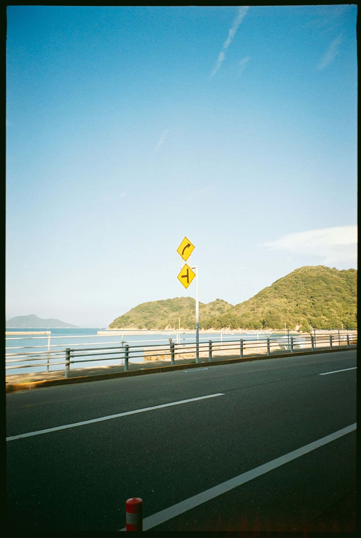
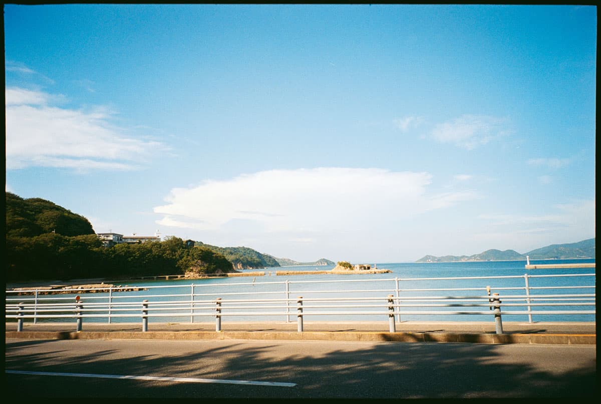
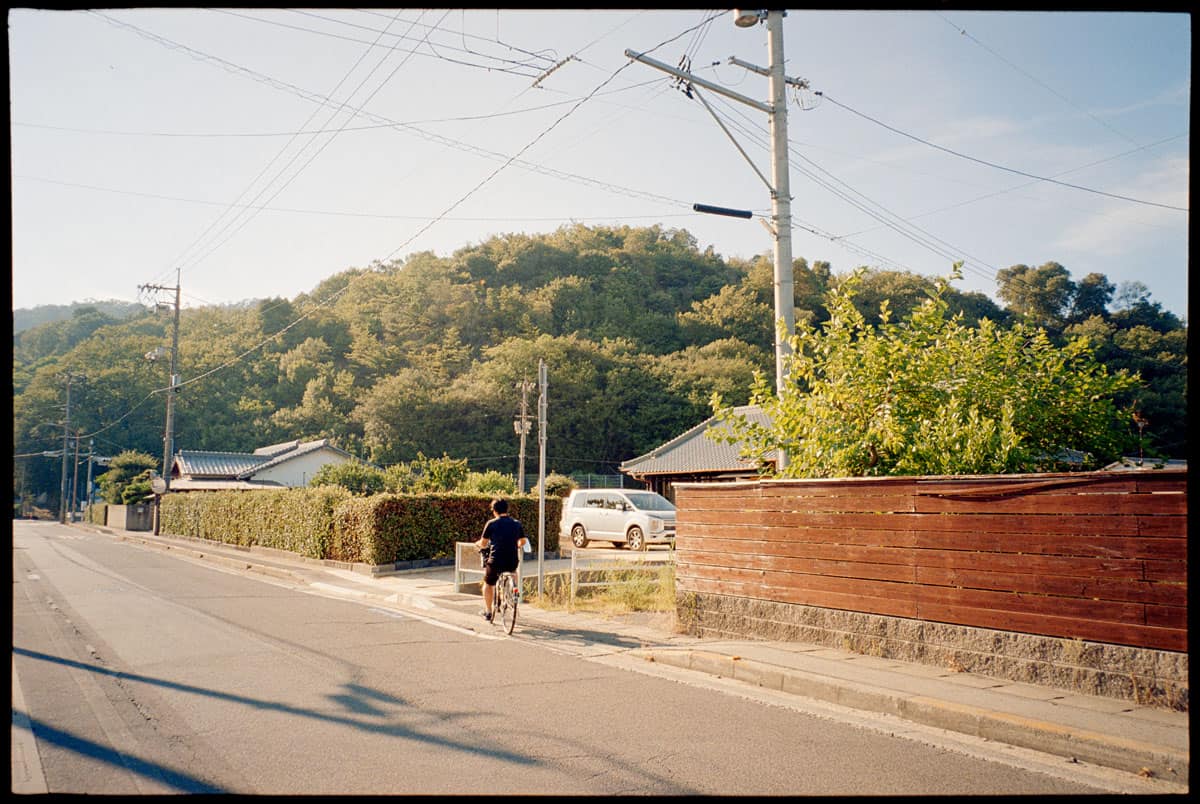
Looking at the results, the first thing that stands out is the overall punchiness. The colors don’t feel muted or overly washed out, there’s a nice balance of contrast that makes the scenes pop without looking too digital or artificial.
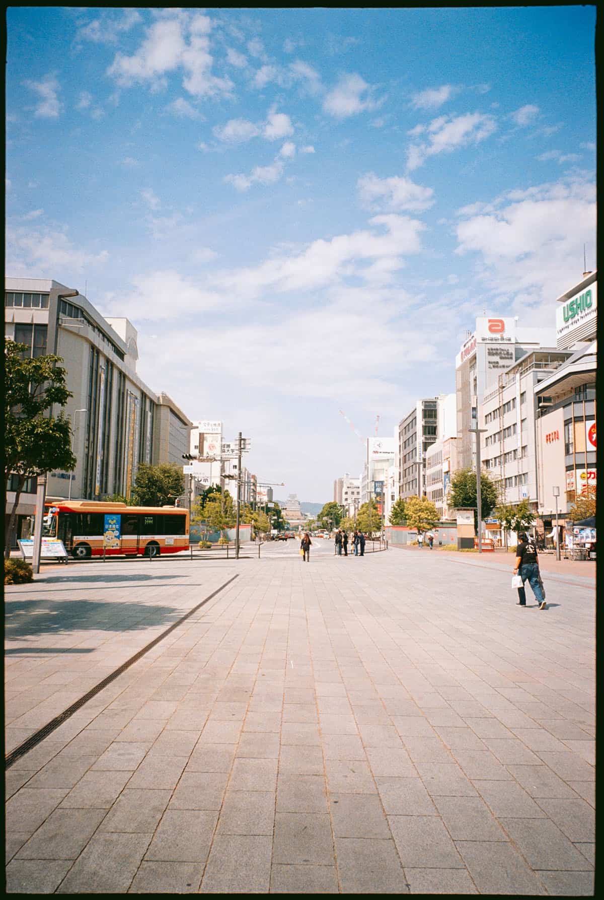
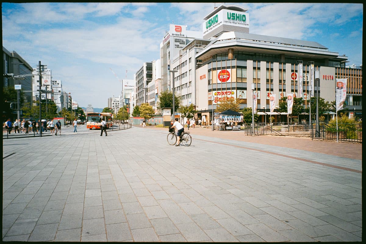
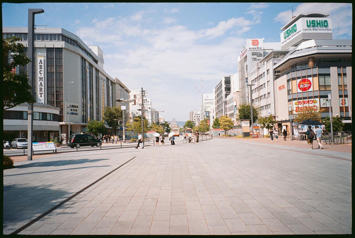

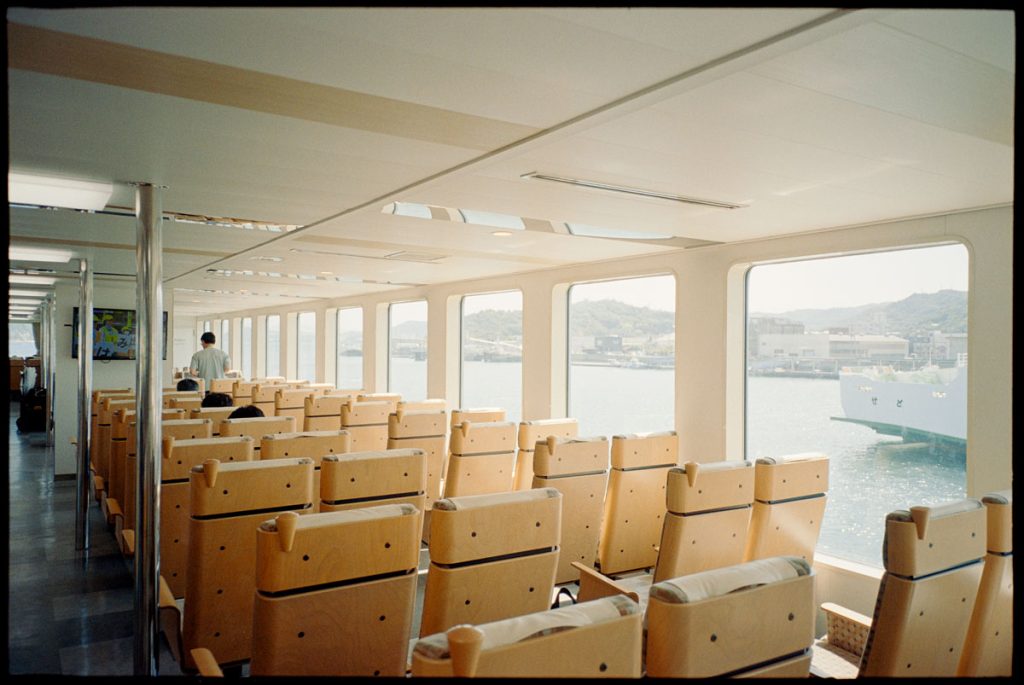
The blues in the sky are rendered clean and slightly cool, while the buildings lean toward warmer tones. It almost feels like a mix between Kodak’s warmth and Fuji’s hint of greenish balance, which gives the photo a lively yet natural character. Skin tones and small details (like the red bus or signage) come out crisp and vibrant, without bleeding too much.

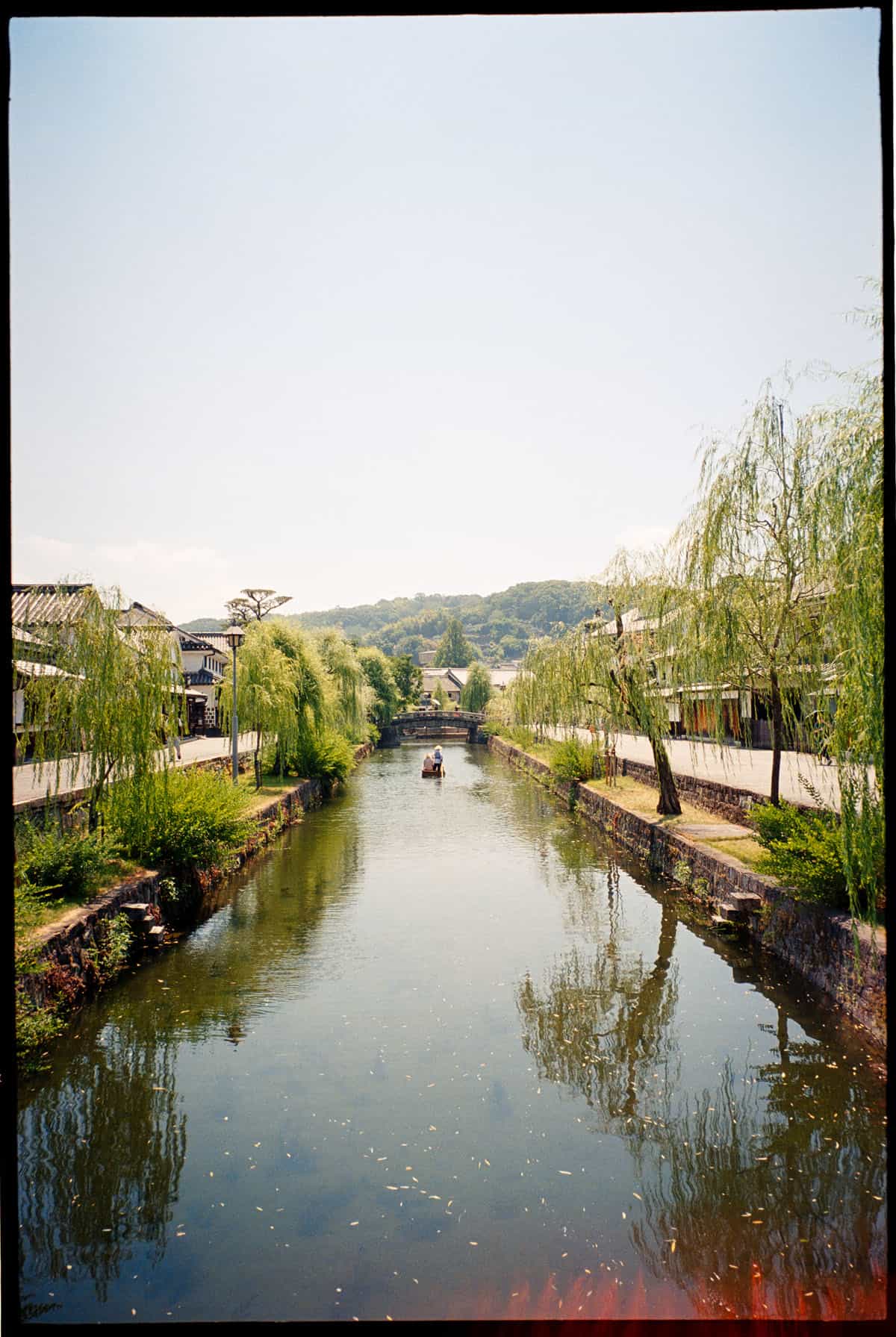
In the above photos, the greens are more noticeable. They’re not the deep, forested greens you might get with Fuji Pro 400H, but more of a bright, yellow-green that works well in sunny conditions. It gives the photo a cheerful, summery vibe, though I could see it being tricky if you want more subtle, pastel tones.
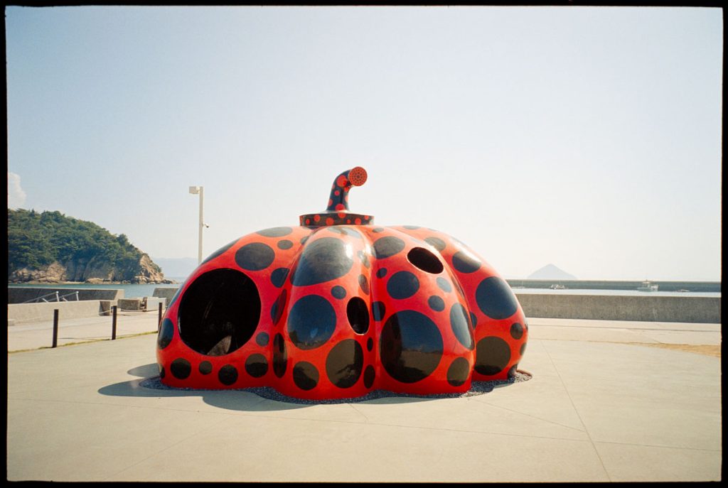
The above shot really shows how this stock handles strong reds. The Kusama sculpture is bold and saturated, but the film keeps it under control, it doesn’t clip or oversaturate the reds, which is impressive for a 400 ISO stock in bright light.
Combined with the clean rendering of the sky, it feels balanced and well-rounded. But I personally feel that the sky is losing its details.

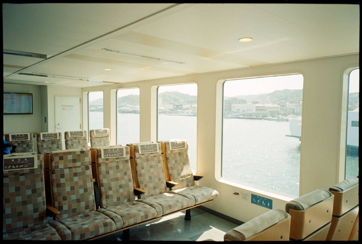
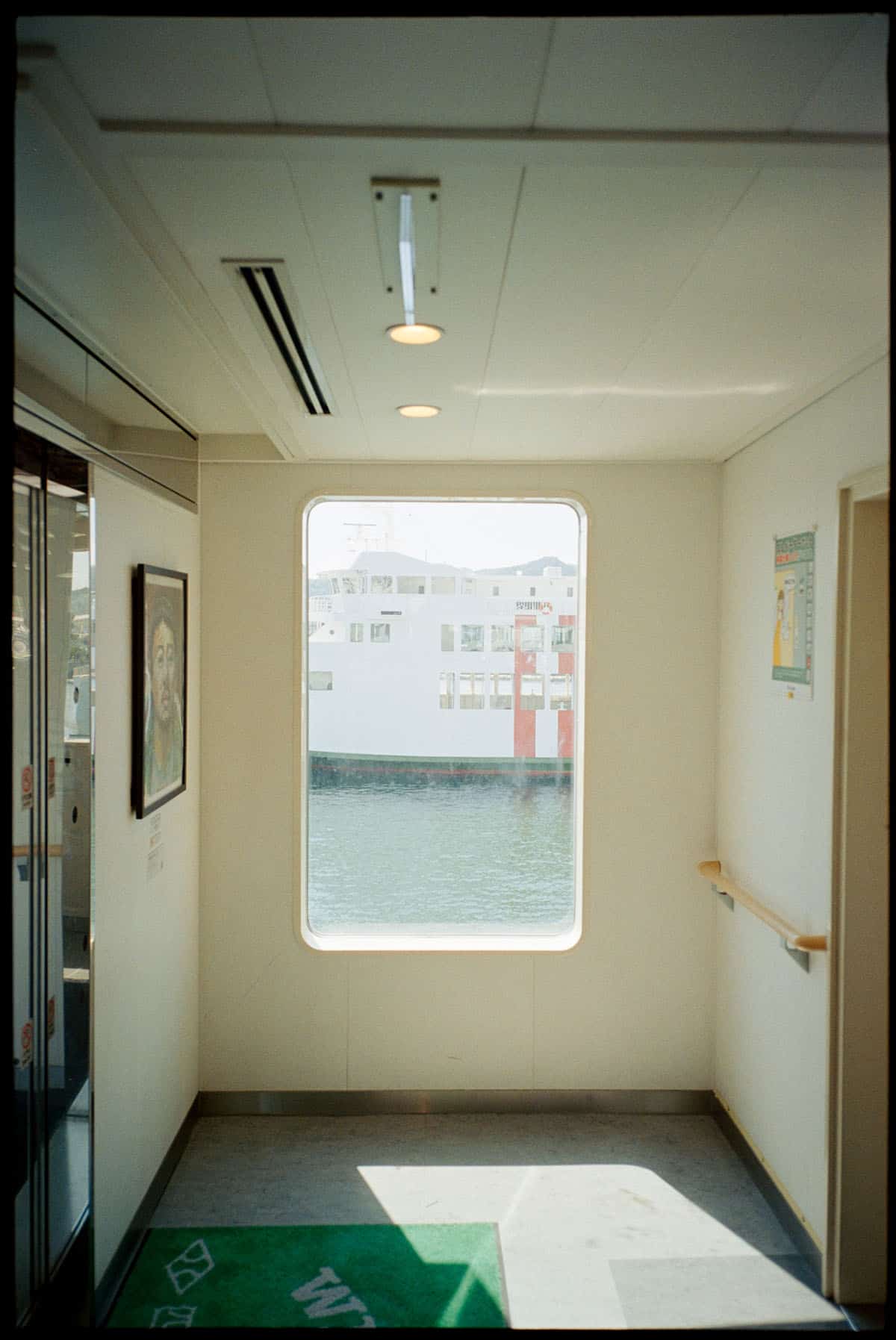


Grain-wise, it looks relatively fine for a 400 film. There’s texture there, but nothing distracting. It keeps that filmic character without being too gritty, making it suitable for both everyday shooting and more intentional projects.
Overall, my first impression is that Same Same But Different 400 has a fun, versatile look. It’s got some of Kodak’s warmth, a hint of Fuji’s greens, and enough punch to make colors stand out without going overboard. It feels like a film you can confidently use on a trip and trust to deliver lively results across different subjects: city streets, landscapes, and even strong-colored artworks.
My Verdict of Same Same But Different Film
So, would I recommend Same Same But Different 400? I think yes, but with a caveat. If you’re looking for a budget everyday stock, this isn’t it, maybe better to go with Kodak ColorPlus or Gold. At $20 a roll, it sits in that middle ground where you’ll want to shoot it with intention. But if you’re curious to try something fresh, or you enjoy that mix of Kodak’s punch and Fuji’s cooler greens, it’s definitely worth a roll or two.
What I like most is that it doesn’t feel like a copy of any existing stock, it has its own character. The colors are lively, the grain is pleasant, and it handles both city streets and nature really well. It might not replace Portra or Gold as your go-to, but it’s a fun addition, especially if you enjoy discovering new looks and supporting small film makers.
At the end of the day, I’m glad I tried it. And honestly, having these new, experimental stocks pop up keeps the whole community alive and exciting.


Thank you so much, Raufan! Raufan is a regular contributor here at Shoot It With Film, and you can check out his other articles here, such as Rediscovering Street Photography: Slowing Down and Experiencing the Moment and Ilfocolor Vivid 400 Film Review: First Impressions.
You can also check out more of his work on Substack, YouTube, Instagram, and Twitter.
Leave your thoughts and questions about Mr. Negative Same Same But Different 400 film below in the comments, and you can pick some up for yourself on the Mr. Negative website.




Leave a Comment
Shoot It With Film on Instagram


Blog Comments
GS
September 4, 2026 at 7:36 am
> I heard it’s from Fuji
Whaa? That would mean that Fuji is selling its Superia Premium 400 to respollers?
Raufan
September 10, 2026 at 7:36 am
Actually not sure, but that’s what I heard from few of my friend in the film lab across SEA and Aussie. But the color is similar tho.
Joseph
September 4, 2026 at 11:25 am
Overall effect I’d say is very nice tones! I like your images and the overall feel of it. Have a good upcoming weekend!
Raufan
September 10, 2026 at 7:37 am
Thank you!! Hope you had a good weekend too!
Eddy
September 4, 2026 at 11:47 am
Very nice photos. If they sold it in the states I would buy some. I wish someone would buy Fuji superia from Japan in bulk in the states and resell it . I would definitely buy it.
Raufan
September 10, 2026 at 7:38 am
Thanks! Oh, I actually thought Mr. Negative distribute this to the States as well.
But yeah, I can say this is a pretty good budget film!